Tate email gallery from real brands
1. 💌 Art in your inbox
Objective
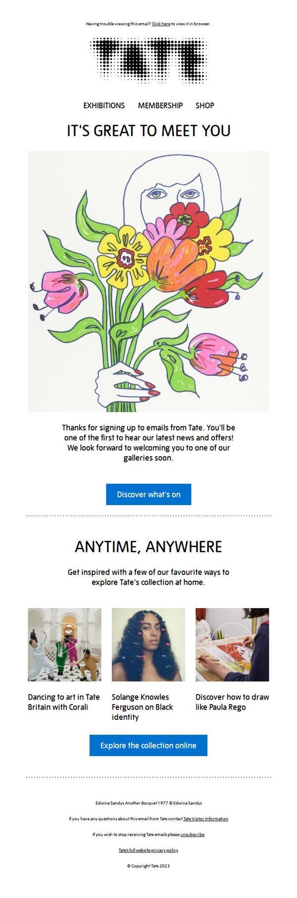
This welcome email aims to warmly onboard new subscribers by expressing gratitude and setting the tone for an ongoing relationship centered on art discovery. It encourages immediate engagement by directing users to explore current exhibitions and digital content from Tate’s collection.
Why this works
The email opens with a personal, hand-drawn illustration that instantly conveys Tate’s creative spirit, making the welcome feel human and emotionally resonant rather than transactional or corporate.
How to implement
By immediately offering curated, bite-sized digital experiences like dancing with Corali or learning to draw like Paula Rego, the email transforms passive subscribers into active participants in Tate’s artistic world.
Pro Tip
Add a secondary CTA beneath the 'Explore the collection online' button that links to Tate Membership, leveraging the welcome moment to convert curious subscribers into supporters with a clear value proposition. • Include a small, visually subtle countdown or 'New this week' badge near the hero image to create urgency and reinforce the promise of being 'first to hear' about news and offers.
2. Thank you for registering
Objective
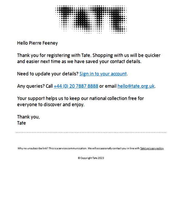
This email aims to warmly welcome new registrants by confirming their account setup and reassuring them that future shopping will be faster and more convenient. It also subtly reinforces the value of their support to Tate’s mission while providing clear contact options for assistance.
Why this works
The email opens with a personalized greeting that immediately builds rapport, making the recipient feel recognized and valued rather than just another database entry, which strengthens emotional connection from the first line.
How to implement
It strategically links user convenience, 'shopping will be quicker and easier next time', to the act of registration, reframing account creation as a benefit rather than a chore, which increases perceived value and future engagement.
Pro Tip
Add a secondary CTA such as 'Explore Our Collection' or 'Start Browsing' to guide users toward immediate engagement, reducing the risk of passive reading and increasing the chance of first-time purchase or exploration. • Include a brief visual element, even a small branded icon or divider, to break up the text-heavy layout and reinforce brand identity, making the email feel more polished and less like a generic system message.
3. Did photography change art forever? 📸
Objective
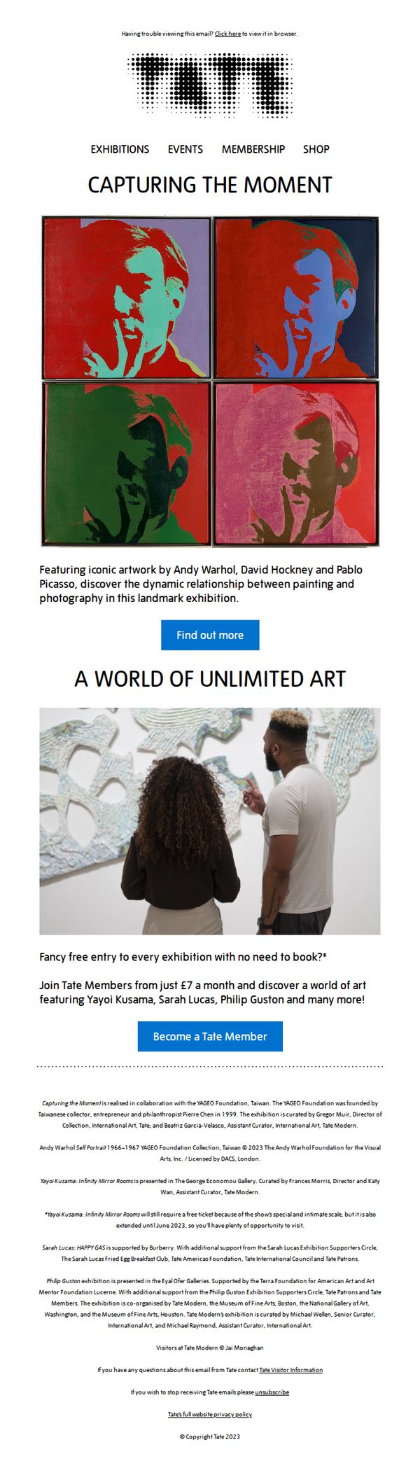
This email aims to drive Tate membership sign-ups by highlighting a major photography-and-painting exhibition, positioning membership as the key to unlocking exclusive, book-free access to world-class art experiences.
Why this works
The email brilliantly frames membership not as a transaction but as a gateway to cultural access, using the headline 'Fancy free entry to every exhibition with no need to book?' to immediately communicate tangible, frictionless value that resonates with time-poor art lovers.
How to implement
By anchoring the campaign around a landmark exhibition featuring Warhol, Hockney, and Picasso, the email leverages iconic names to create instant credibility and urgency, making the membership offer feel like a front-row ticket to art history rather than a generic subscription.
Pro Tip
Add a subtle countdown timer or limited-time badge near the 'Become a Tate Member' CTA to create urgency, especially since the exhibition is time-bound and membership offers immediate access, this would nudge hesitant readers to act now rather than later. • Include a short testimonial or quote from a current member about the value of free, no-book entry to exhibitions, this social proof would reinforce the offer’s appeal and reduce perceived risk for new sign-ups.
4. Verify your account
Objective
This email aims to confirm the user’s identity by prompting them to verify their account after registration, ensuring secure access and compliance with Tate’s communication policies.
Why this works
The email opens with a warm, personal greeting that immediately acknowledges the user’s action, making the verification feel like a natural next step rather than a barrier to entry.
How to implement
By embedding the CTA as a simple, underlined hyperlink within a clear instruction, the email reduces friction and leverages intuitive user behavior to drive immediate action without visual clutter.
Pro Tip
Add a secondary CTA or reminder text near the bottom, such as 'Didn’t receive the link? Check spam or request a new one,' to reduce support inquiries and account abandonment. • Include a subtle visual cue like a small icon or border around the CTA link to increase visibility and click-through, especially for users scanning the email quickly on mobile.