Software welcome email gallery from real brands
1. Flipdish: [Flipdish] Your new Flipdish Portal account
Objective
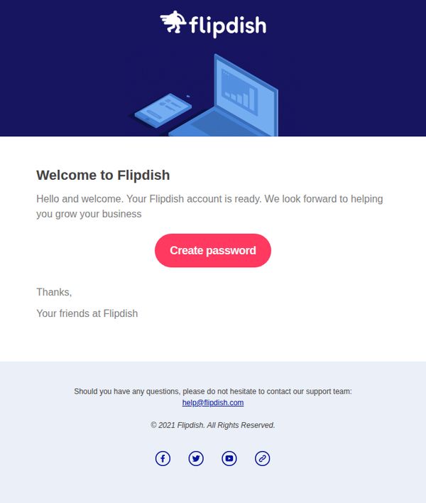
This email aims to welcome new users to their Flipdish Portal account and guide them to set up their password, establishing the first step in onboarding while reinforcing brand support and trust.
Why this works
The email opens with a warm, personalized welcome that immediately reassures new users their account is active and ready, reducing friction and building confidence in the onboarding process.
How to implement
A bold, contrasting CTA button labeled 'Create password' stands out visually and functionally, making the next step unmistakable and reducing cognitive load for the user.
Pro Tip
Add a brief bullet-point list under the welcome message outlining what users can do after setting their password, such as managing orders, viewing analytics, or customizing menus, to increase perceived value and motivation to complete setup. • Include a small visual cue or progress indicator near the CTA (e.g., 'Step 1 of 3: Set your password') to frame the action within a larger onboarding journey, reducing drop-off and increasing completion rates.
2. SecurityScorecard: Welcome to SecurityScorecard!
Objective
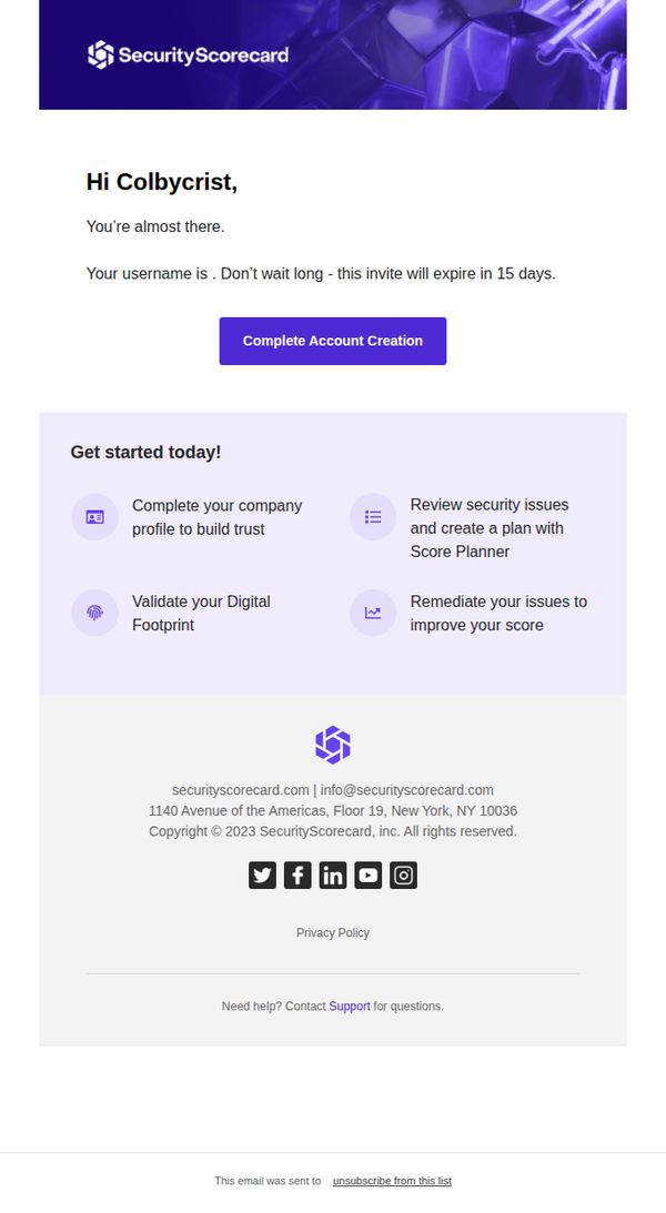
This email aims to guide new users through final account setup while creating urgency with a 15-day expiration, encouraging immediate action to activate their SecurityScorecard account and begin improving their security posture.
Why this works
The email smartly pairs urgency with clarity by stating the invite expires in 15 days while immediately offering a bold, centered CTA that removes friction from the next step in the onboarding journey.
How to implement
By breaking down the first actions into four digestible, icon-supported tasks, the email reduces overwhelm and gently guides the user toward meaningful engagement without demanding too much upfront commitment.
Pro Tip
Add a subtle countdown timer or progress bar near the CTA to visually reinforce urgency and guide users toward completion before the 15-day window closes. • Replace the generic 'Get started today!' section header with a benefit-driven headline like 'Unlock Your Security Insights in 4 Simple Steps' to better align with user motivation.
3. SecurityScorecard: Welcome to SecurityScorecard!
Objective
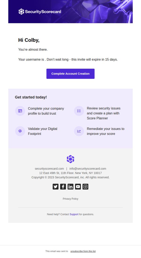
This email aims to guide the new user, Colby, through the final step of account creation by emphasizing urgency with a 15-day expiration and clearly outlining the immediate value they’ll unlock by completing their profile and validating their digital footprint.
Why this works
The email creates immediate momentum by framing account completion as the gateway to tangible security outcomes, like building trust and improving scores, rather than just another form to fill out, which aligns user action with business value.
How to implement
Using a personalized name and a time-sensitive expiration notice (15 days) transforms a generic welcome into a high-stakes, user-specific moment that reduces procrastination and increases conversion urgency without feeling pushy or salesy.
Pro Tip
Add a subtle progress indicator or checklist next to each of the four onboarding steps to visually reinforce completion status and motivate users to check off each action as they go, increasing perceived momentum and reducing drop-off. • Reposition the 'Complete Account Creation' CTA to appear again at the bottom of the 'Get started today!' section, right after the user reads the value they’ll unlock, to reduce friction and capitalize on peak motivation.
4. Deliverect: 👋 Welcome to Deliverect!
Objective
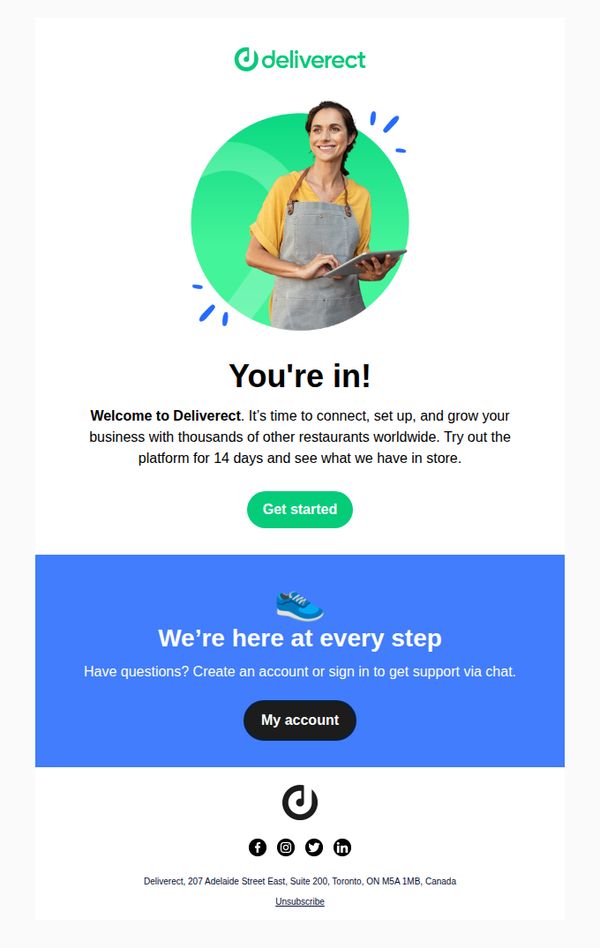
This email welcomes new users to Deliverect and encourages them to begin exploring the platform’s features during a 14-day trial period, with the goal of converting them into active, engaged customers by highlighting global restaurant community benefits.
Why this works
The email opens with a warm, human-centered visual and headline that instantly validates the user’s decision to join, reducing early friction and building emotional momentum toward onboarding.
How to implement
By anchoring the offer in a 14-day trial framed as an exploratory experience rather than a sales pitch, the message lowers perceived risk and invites curiosity-driven engagement without pressure.
Pro Tip
Add a subtle visual cue or micro-animation near the 'Get started' button to draw attention and guide the user’s eye toward the primary action, improving click-through rates without disrupting simplicity. • Include a brief, bulleted list of 2–3 key features or outcomes users can expect during the 14-day trial to clarify value and reduce ambiguity about what 'see what we have in store' actually means.
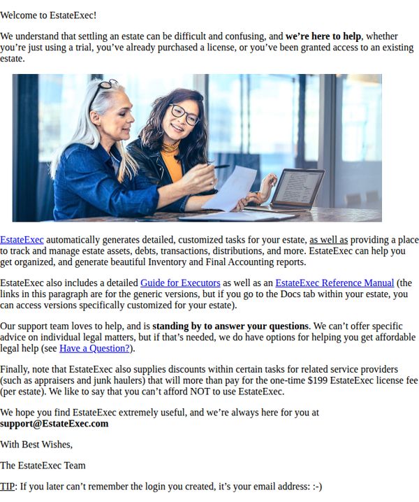
5. EstateExec: Welcome to EstateExec
Objective
This email aims to warmly welcome new users to EstateExec by reassuring them that estate settlement doesn’t have to be overwhelming, while clearly outlining the platform’s core value, automated task generation, asset tracking, and legal support, to build immediate trust and encourage active onboarding.
Why this works
The email opens with empathy, acknowledging the emotional weight of estate settlement, which instantly builds rapport and positions EstateExec not as a tool but as a compassionate partner in a stressful life event.
How to implement
It strategically highlights the $199 license fee not as a cost but as an investment that pays for itself through discounts on third-party services, reframing pricing as a financial advantage rather than an expense.
Pro Tip
Add a prominent primary CTA button above the fold, such as 'Start My Estate Plan' or 'Log In to Begin', to guide users toward immediate action instead of relying solely on a text-based 'Have a Question?' link buried in the body. • Include a short video or animated GIF in the hero section showing the platform’s interface in action, demonstrating how tasks auto-generate or reports are built, to visually reinforce value and reduce cognitive load for new users.
6. My Choice Software: Customer account confirmation
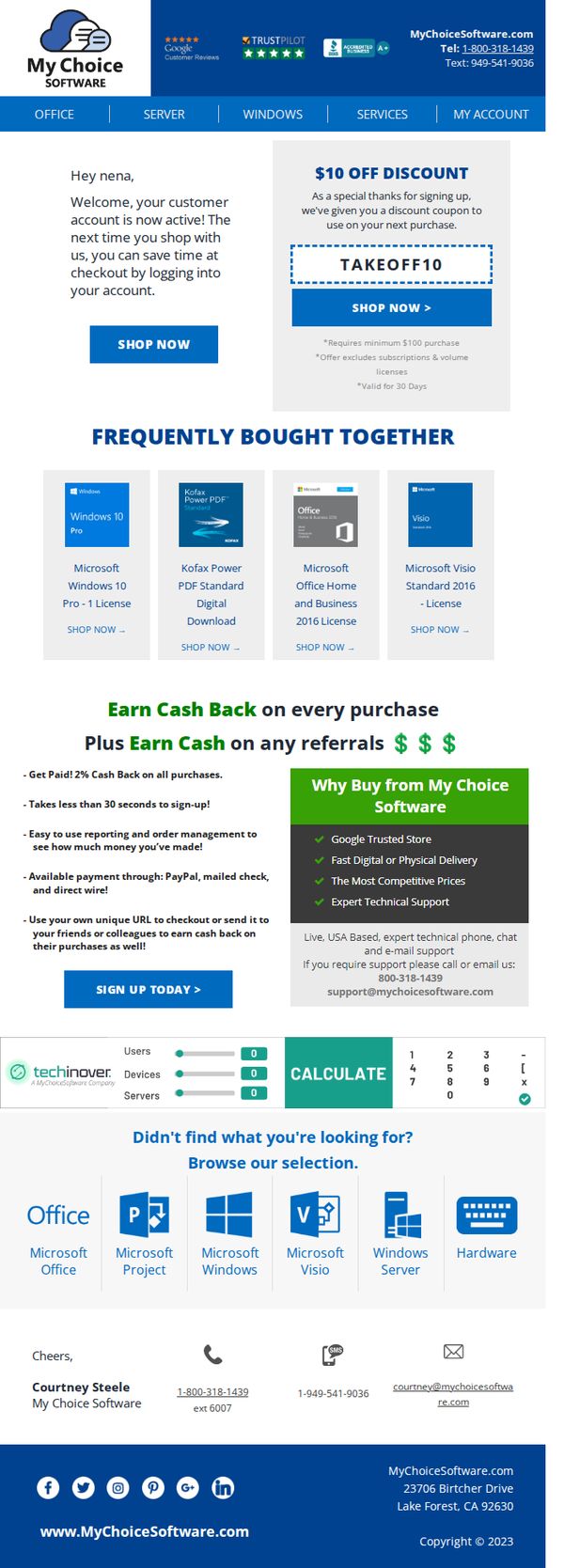
Objective
This email confirms the activation of a new customer account and immediately incentivizes the first purchase with a time-sensitive $10 discount. It also introduces the brand’s cash-back and referral rewards to encourage repeat engagement and social sharing.
Why this works
The email immediately rewards new account activation with a tangible, time-bound discount, turning a routine confirmation into a conversion opportunity that leverages urgency and personalization.
How to implement
By featuring 'Frequently Bought Together' products with clear licensing details and direct purchase links, the email anticipates customer needs and reduces friction in the decision-making process.
Pro Tip
The primary CTA 'SHOP NOW' appears twice but lacks visual hierarchy, consider using contrasting color or size to make the discount CTA stand out more prominently than the general shop button. • The 'Why Buy from My Choice Software' section is visually strong but could benefit from a customer testimonial quote or star rating graphic to reinforce trust signals already mentioned in the header.
7. My Choice Software: 😎 Welcome, August Products Of The Month!
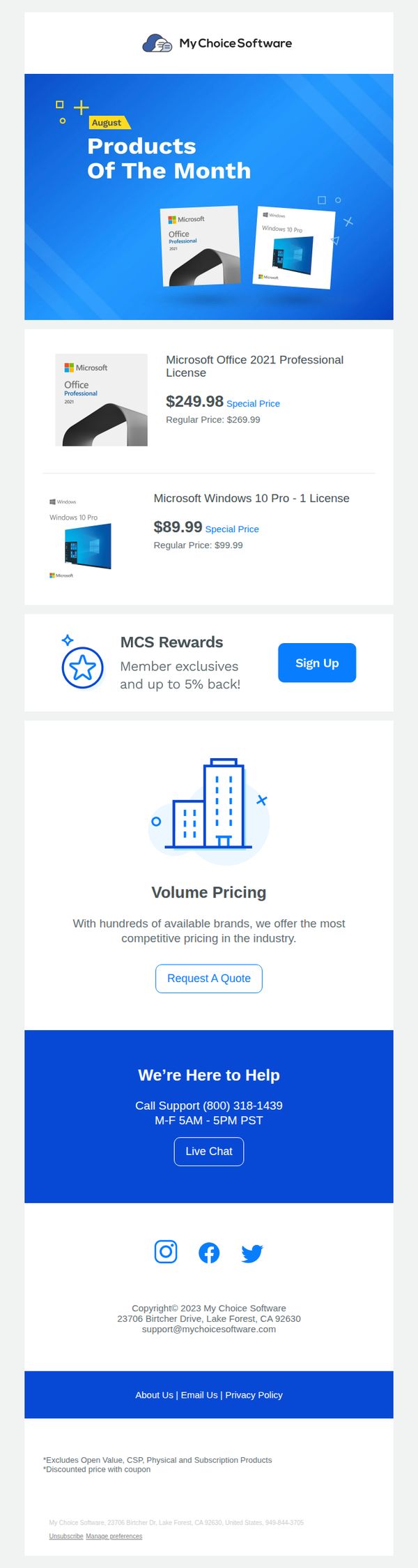
Objective
This email aims to drive immediate sales by spotlighting August’s featured Microsoft software products with discounted pricing, while also encouraging new member sign-ups through a rewards program to build long-term customer loyalty.
Why this works
The email immediately grabs attention by using a bold hero section with a clear 'Products of the Month' headline and visual product mockups, making the offer instantly recognizable and reducing cognitive load for the reader.
How to implement
By displaying both the special price and regular price side-by-side for each product, the campaign creates a strong perception of value and urgency, which can significantly boost conversion rates among price-sensitive software buyers.
Pro Tip
Add a countdown timer or 'Limited Stock' indicator near the product prices to create urgency and prevent procrastination, especially since software licenses are often purchased on impulse when perceived as scarce or time-sensitive. • Include a short customer testimonial or star rating next to each product to build trust and reduce perceived risk, especially important for digital software purchases where users can’t physically inspect the product before buying.
8. Kit: Kit Product Updates: February 2026

Objective
This email aims to inform Kit users about new product features and integrations released in February 2026, encouraging adoption through clear CTAs while reinforcing brand value by showcasing strategic partnerships and educational opportunities.
Why this works
The email leads with a high-impact integration, Kajabi, that solves a real pain point for course creators, immediately signaling value by showing how automation reduces manual work while increasing student engagement and revenue potential.
How to implement
Each new feature is presented with a clean visual icon, a benefit-driven headline, and a direct CTA, making it effortless for users to understand what’s new and take action without scrolling or searching for next steps.
Pro Tip
The 'Save your seat' CTA for the webinar is visually underwhelming compared to the primary 'Connect Kajabi to Kit' button; increasing its size or using a contrasting color would better reflect its strategic importance in driving user education and platform stickiness. • The feedback section at the bottom uses radio buttons without a submit button, which may confuse users; adding a clear 'Submit Feedback' CTA or converting it to a one-click rating system would improve completion rates and data quality.
9. Café: Yayyy, welcome to Café! 🎉
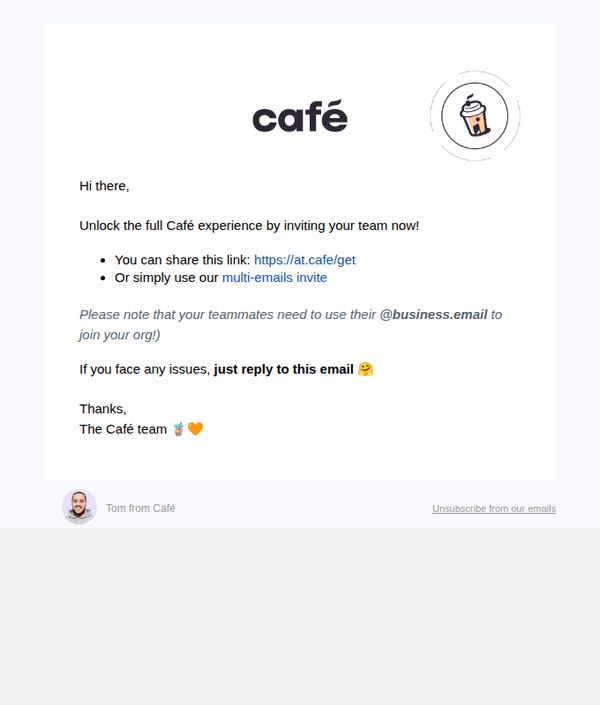
Objective
This email aims to welcome new users and encourage them to invite their team members to join Café, thereby expanding platform adoption within organizations through peer-driven onboarding.
Why this works
The email opens with a warm, celebratory tone using emojis and casual language to make the recipient feel personally welcomed, which builds immediate emotional connection and reduces friction in early engagement.
How to implement
It offers two clear, frictionless pathways to invite teammates, a direct link and a multi-email tool, giving users flexibility based on their workflow, which increases the likelihood of conversion through choice architecture.
Pro Tip
Add a visual cue or button highlighting the primary CTA 'Invite your team now' instead of burying it in bullet points, this would improve click-through by making the next step visually dominant and action-oriented. • Include a brief social proof element, like 'Join 10,000+ teams already using Café' or a mini testimonial, to reinforce trust and urgency, currently, the email lacks persuasive validation that could boost team adoption rates.
10. Accruent: New Ideas, Real Progress - Welcome to Accruent Built For What's Next!
Objective
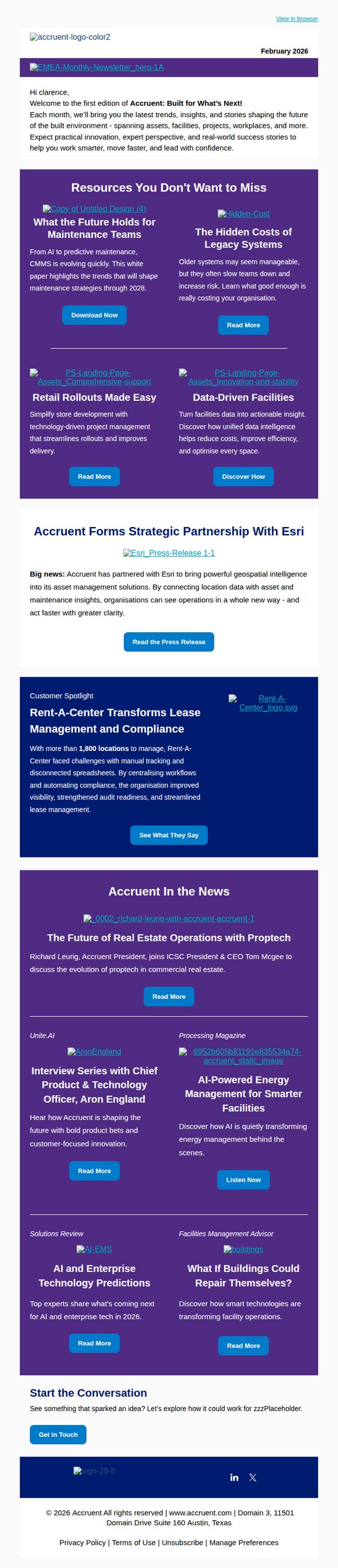
This email aims to welcome new subscribers to Accruent’s monthly newsletter by positioning the brand as a forward-thinking leader in built environment innovation, while encouraging engagement through curated resources, strategic updates, and customer success stories.
Why this works
The email strategically opens with a personalized welcome that immediately frames the newsletter as a valuable, forward-looking resource rather than just promotional content, building trust and setting clear reader expectations from the first sentence.
How to implement
By organizing content into digestible, benefit-driven resource tiles with clear CTAs like 'Download Now' or 'Read More,' the email guides users through multiple engagement paths without overwhelming them, making it easy to choose what’s most relevant to their role or challenge.
Pro Tip
The primary CTA 'Get in Touch' at the bottom lacks urgency or context; repositioning it as a sticky footer button or pairing it with a value-driven prompt like 'Schedule Your Free Strategy Session' would better convert interested readers into leads. • The 'Accruent In the News' section feels disconnected from the newsletter’s core theme of innovation; integrating a short teaser like 'See how industry leaders are applying these insights' would better tie press coverage back to actionable value for the reader.